2020, Surrey, Canada
The Moment
Steel, 6.8 x 4.9 x 3.9 m
Commissioned by the City of Surrey, British Columbia, Canada


In early 2018, Heather Peak and Ivan Morison spent three months of research and community engagement with three hundred residents from Clayton in Surrey, Canada. Locals of all ages and backgrounds shared their reflections on their neighbourhood, as well as their aspirations for a public artwork to capture the place they call home. The process culminated in a second Impossible Rainbow Dinner, this time at a local school. The artists collaborated with students to make crockery from moulds of an old softball and deflated basketball found on the site of the future Clayton Community Centre. They turned these discarded objects into something functional and beautiful, demonstrating the power of art to transform our everyday lives. Sixty-five people from the neighbourhood came to the dinner, attendees giving feedback about the future artwork. One wrote, ‘Please make something to bring us together like this.’
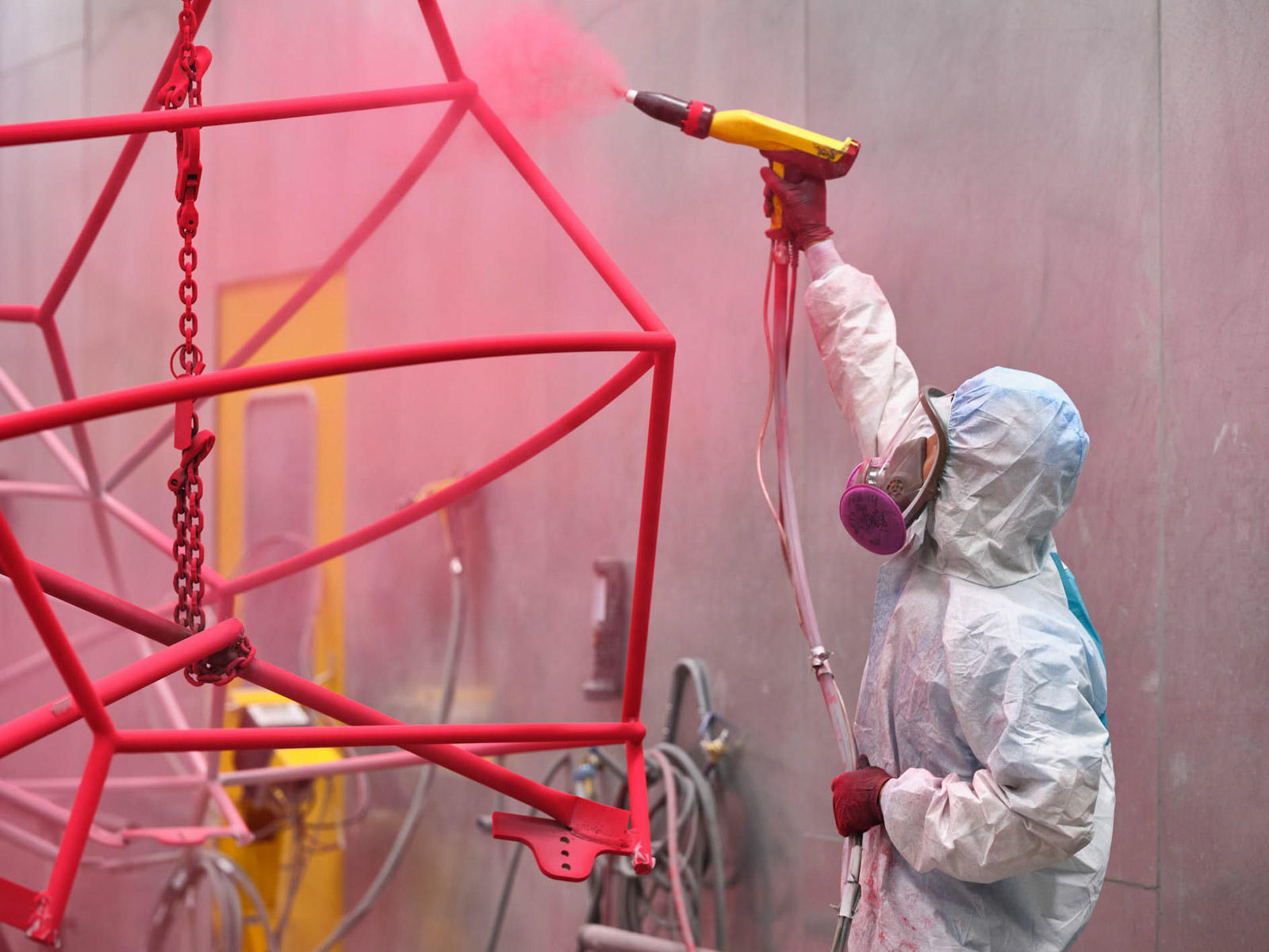
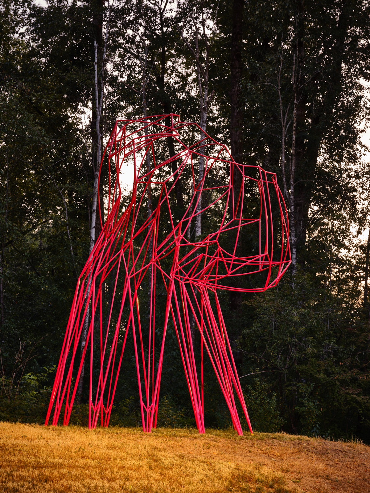
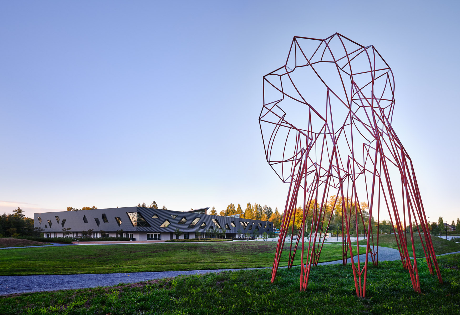
That is just what The Moment is about – bringing people together in a shared space, allowing for different levels of engagement and creating an open form that can be transformed in multiple and unexpected ways. Made of steel and standing over six metres tall, the work alludes to gathering spaces like pavilions, bandstands, and agoras. Comprised of straight and curved lines coloured a bright raspberry to stand out against the trees, it is a frame in which anything can happen. It is a place to make art, meet friends, and transform for events. It could be draped with fabric to provide a summer reading space, strung with garlands for an open-mic music evening, or transformed with lights into a glowing lantern. In short, it is a place for the community to make meaningful moments of their own.
The form itself invites the question ‘what is it?’ The artists say, ‘As you move around and within the piece, it continually reveals and confuses its own form, alive and full of potentiality.’ From each angle, a different interpretation emerges: a net, a web, a flower turning its head to the sun, a make-believe creature waiting to play with a friend, a tower leaning over to listen to the people below. It is an outline to ‘colour in’, inviting the community to fill it with their own imaginations.
The title comes from a Margaret Atwood poem of the same name that questions individual ownership of one’s natural surroundings and speaks to the concept of ‘the commons’
at the heart of the Clayton Community Centre and civic life in general. At a time of increasingly privatized land, how do we hold a space in common that everybody can use and enjoy?
‘On our first visit to the site, we saw the sharp crisscross of bare branches in the sky, and at our feet the geometry of forming ice crystals. In our minds were creeping vines and skeletal pagodas from Venice, the volume within the curving ribcage of a blue whale, the bent frames of early local shelters, a cow carcass hung from a tree in the yard of our studio this past year changing, slumping slowly as time passes. Straight lines, curved lines, lines that define a form no longer present, or still to be. These were our starting points for this artwork.
A trope at the centre of our work is a simple action repeated. In this case, we began with a fold, repeated twenty-four times to create a pleated surface. To this, we applied V-folds, the action of which changes the direction of the pleat, introducing movement. This pleated and folded form is drawn around on itself, creating geometric structural form.
The pleating and folding is repeated and repeated in paper many times, generating multiple prototypes. One is selected, it is made solid, and a complex plaster mould is taken. A clay slipcast form is created, sanded, fired. The kiln is set very high, the ceramics vitrify, melt, and slump in
the kiln. The heat is extraordinary, the process elemental. The only influence we can have is the original form and the thickness of the clay walls we have created. Time and again, we cast more forms, fire them, wait and wait for them to cool to see the results.
Finally, we arrive at a form that offers the characteristics we are looking for, that embodies the movement of the naked branches, the perfection of the ice, the volume of a whale, the shelter of the early bent frames, the passage of time, captured in a single moment. Now the slumped ceramic form is 3D-scanned and translated into digital form. On screen, its facets are removed and it is reduced down to its own skeleton, some parts still strongly geometric, others more organic, curving, and sagging. The frame is engineered, steel rod weights calculated, a colour chosen – raspberry – and it is sized to the scale of a whale, an iconic sculpture, a pavilion, with a strong sense of gathering, of celebration.’
Ivan Morison
Photographers’ credits
All’s Well that Ends_ Ivan Morison
All’s Well that Ends_ Ivan Morison